T-Shirt Fails: 7 Common Design Mistakes (and How to Fix Them)
- Edgar Stepanyan
- Nov 21, 2025
- 2 min read

We’ve all been there — but it doesn’t have to happen again. Here are 7 design mistakes that ruin good shirts (and how to make sure yours stand out in the best way 👕🔥
1️⃣ Tiny Logos

If your logo’s the size of a coin, no one can read it! Go bold and visible — your shirt should say something from a few feet away.
2️⃣ Poor Color Contrast

Light ink on light fabric = invisible. Always test your design on the actual shirt color before printing.
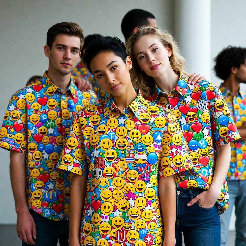
3️⃣ Overcrowded Layouts

Too much text and too many graphics make shirts look messy. Clean designs always win.
4️⃣ Ignoring Placement

A crooked print or a logo that sits too low can throw off the whole look. Centering and mockups are key.
5️⃣ Low-Quality Images

Pixelated prints scream “DIY gone wrong.” Always use high-resolution artwork — at least 300 DPI.
6️⃣ Wrong Font Choices

Thin, fancy fonts may look great on a screen but vanish on fabric. Pick something bold, simple, and legible.
7️⃣ Forgetting the Feel

The best design in the world means nothing if the shirt is uncomfortable. Choose soft, durable blends that people want to wear again and again.
💡 Pro Tip: Before hitting “print,” order one sample. It’s the easiest way to catch issues before you invest in a full run.
When done right, a T-shirt isn’t just a giveaway — it’s a walking billboard for your brand. 🧵✨ Let us help you design one worth wearing.


Comments